DOmore
Conceptual project: Logo
“DOmore” is a children’s village for orphans and children with disabilities. This is a unique place where children receive not only formal care but they can understand the meaning of the word
“family”. Somewhat the idea for this village overlaps with the existing SOS Children’s Villages, but “DOmore” has more advantages.
“DOmore” is a compound with 6 self-contained buildings. In the village, all children under 18 years old without parents are welcome, even those with disabilities.
This project contains
In every society, it’s crucial to have at least one institution which is to be in charge of orphans and children with disabilities. With the vision of the brand identity, I wanted to show the confidence and strong character of the foundation members. They believe that there is always something more to be done for those children, which is their goal.

Naming
The name of the village hints at its main advantage: this place is doing more for the children than any other childcare institution. It offers not only formal care but the children can understand the meaning of the word “family”. Even children with disabilities are welcome because in the village there are medical personnel. The health specialists are responsible for preventive maintenance, treatments and emergency aid.
The appeal “DOmore” is used in each part of the corporate communication with the main purpose of recovering donations.
Logo concept
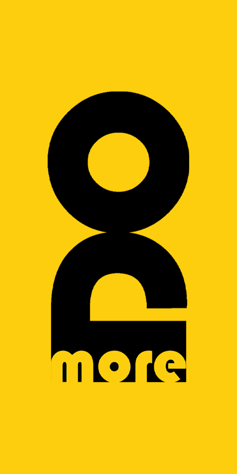
The idea for the logo came from the famous children’s game “Ludo”. The form of the pawns reminds us of the human silhouette. The typographic realization bears the message “Do more!” and the form gives a hint of who needs some help.


